630°

If this is really the new Doom box art, it sucks

DTOID:
Conan O'Brien will be playing the latest iteration of Doom on his show's Clueless Gamer segment tonight with some players of the sports ball who are in the big game. In a tweet promoting the show, the box art below was shown, though it hasn't been confirmed as the final retail version just yet.

Read Full Story >>
destructoid.com
-Foxtrot3017d ago (Edited 3017d ago )

I was hoping for something which felt a bit retro.

Maybe an updated old school style cover. Hell they could have least done that for the Steelbook version. The artwork for that is just as bad. To be honest if the statue you got with the game was Doom guy in that retro pose firing at demons that would have been epic

It's not that hard to update it

http://i.kinja-img.com/gawk...

crazychris41243016d ago

Looks like Master Chief's cousin. Your idea sounds better. But not really a big deal, the gameplay is what matters.

Bdub20003016d ago

That's what I was thinking... Master chief is the hero?

breakpad3016d ago (Edited 3016d ago )

if this cover is true is not only a bad cover but is also an indicator that these developers have an ultra generic mind which may be also a bad indicator for the quality of the game it self (already this saturation with yellow is emetic)

madpuppy3015d ago

It's almost an exact ripoff of the boring cover from "Section 8: Prejudice" a PS3 digital title.

https://upload.wikimedia.or...

Jayszen3016d ago (Edited 3016d ago )

@Foxtrot

Your suggestion of retro is far preferable to this generic boxart! I was just looking at my original Doom boxes and they look so much better, maybe they should just use the same artwork - it would not look any worse than the design and artwork they have at present.

If Bethesda and ID have gone back to the roots of Doom as they say and have a game that gives us that same feeling of dread, panic and being overwhelmed like the first two Doom games did, why ruin it with such run-of-the-mill artwork? Come on, give us something really original, scary and jaw-dropping for a change. This is Doom after all - I and most gamers I know grew up on these and other games like Hexen, Quake, Wolfenstein and Unreal, spending the better part of our teens and twenties playing these stellar games along with cool strategy games like C & C and X-Com (the original Microprose ones) for a change.

I will buy Doom on May 13, with whatever art there is on the PS4 and PC versions, but with the likelihood that this will be the last Doom for some time at least, I hope Bethesda and iD give us editions that have something different for box art.

3-4-53016d ago

Looks 80% like Halo.

Not original at all.

-Foxtrot3016d ago

I just think it's funny they are trying to say "DOOM'S BACK" but then present such generic artwork with looks like most other FPS covers.

Doesn't really scream "the king is back" does it

Pongwater3016d ago (Edited 3016d ago )

Halo's character design was original?

OT - Couldn't care less about box art myself.

showtimefolks3016d ago

i don't know but cover art really doesn't bother me at all

Kombatologist3016d ago

It looks a lot like the Mortal Kombat X box art, which wasn't all that great either. If this is all it takes to make box art now, then someone please hire me. I can easily slap some text over a render in Photoshop.

TWB3015d ago

I would have been fine with just "DOOM" on the black background... like the placeholder has been up to this point.

OhMyGandhi3015d ago

I really don't get why publishers feel the need to make such a boring cover art. There has to be some science behind it.

Isn't a game's cover art supposed to stand out and NOT blend in with the crowd?

+ Show (4) more repliesLast reply 3015d ago
Paytaa3017d ago

I really don't like it. It just looks like every other game with that box art. They need to add some early 90's flare to it.

Hell, even having a Cyberdemon on the cover rather than Doom Guy would be better.

DivoJones3016d ago

Hell I liked the generic black background and the word DOOM more than this. It looks like literally every other shooter title.. uncharted, bioshock infinite, halo, etc.

Activemessiah3016d ago

I think it's fine, I would want it to be clean, less conspicuous and no real indication of what's inside so that those who first time it is to play Doom would get a shock of their lives due to the graphic content lol
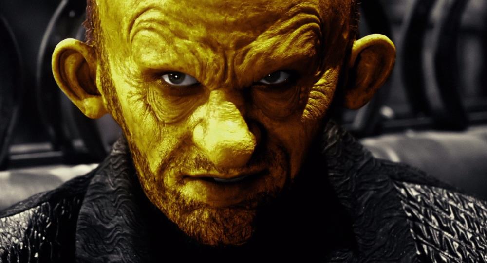
I_am_Batman3016d ago

I doubt that many people buy games based on box art without knowing what they are getting into anymore.

Activemessiah3016d ago

Anyone buying it digitally doesnt even get to see one either.

Walter_Official3016d ago

As a kid thats all i did.. lol

Sciurus_vulgaris3016d ago

Doom guy looks a lot like master chief . In the alpha mp the soldiers moved and looked liked Spartans. The alpha mp felt like halo mixed with quake.

Kleptic3016d ago

but...'doom guy' was a dude in a green suit with a helmet and visor...in 1993...so isn't it the other way around?

Sciurus_vulgaris3016d ago

@Kleptic The original doom guy didn't have power armor. Classic Doomguy's look might have moderately influenced the look of MC. Now it looks like Master Chiefs design may have heavily influenced the new Doom guy's armor.

Kleptic3015d ago

Still feel like its a reach (no pun intended)...

They're all 'space marines'...they're all roughly the same...I was only meaning that I don't think MC influenced this any more than the cryo-suit did, the myriad of armor options in Dead Space, or...what it was originally over 2 decades ago...etc.

MC's significance is that parts of the suit are green...but so was the original doom guy...and so was Doom 3...I more find this new aesthetic a natural progression mostly due to rendering technology...not iD sitting around saying 'lets make him look like Master Chief, even though he sort of always has anyway...'

Morgue3016d ago (Edited 3016d ago )

DooM. But in this day and age you have too wonder if MS had anything to do with this ( which I highly doubt ) but who knows; you gotta lure that customer somehow. Just like in the first Dead Space where the crates you stomped on looked like old Xbox's which I thought of every time I stopmed on one.

Dark_Crow3016d ago

I personally think it's fine.
When you think of DOOM and how they're trying to respect the game and bring it back then the title is most important.

They've respected and paid homage to the title. So DOOM nice and big in the front seems well done in my opinion.

I think that with a limited edition they could bring back the look of the old style doom covers and replace imagery with what they have.

Show all comments (87)
60°

The importance of audio: How music makes games better

How do composers make the iconic music tracks from games that we love? And just what makes them so memorable?

Read Full Story >>
gamespew.com
purple1017d ago (Edited 7d ago )

Twitter is blowing up right now

All games coming to PlayStation
Next Xbox will have steam
Next Xbox niche and only for “gamers who want it” (it’s a really powerful pc or a steam deck type portable, or both)

7d ago
60°

Milestone Games in the History of the First-Person Shooter (FPS) Genre

Have you ever looked at a modern first-person shooter and wondered "How did we get here?" Wealth of Geeks performs a deep dive into the genre, including some of the most influential games, from the very first FPS from the cross-genre experiences that changed the game entirely.

Read Full Story >>
wealthofgeeks.com
shinoff218384d ago

I've looked and wished we never did get here.

70°

The Most Iconic Game Weapons Ever

BLG writes, "There are many fantastic and iconic weapons in game history, but some are significantly more memorable than others. When we think of iconic game weapons, these are the top 20 that come to mind."

Read Full Story >>
bosslevelgamer.com
phoenixwing93d ago

You forgot one and it's a doozy. The weapon is kindness in undertale. :) defeats countless enemies.