
There's something "off" about the new PlayStation 4 logo, and a fan-made version offers a much better alternative.
"The Spain-based indie games publisher Firenut Games and Granada-based (Spain) indie games developer Trigger the Monster, today announced with great joy and thrill that their dark fantasy adventure/management game “Search of Light” (AKA SOL), is now available for PC (via Steam) and consoles (PS5, PS4, and the Nintendo Switch)." - Jonas Ek, TGG.
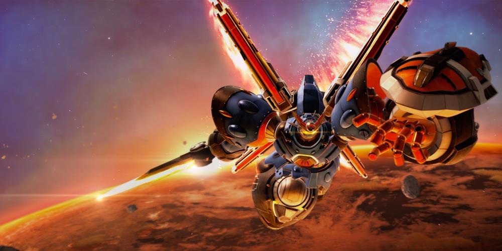
Game Rant participates in the Megaton Musashi World Cup, checking out the game a little bit beforehand and winning the first round match.
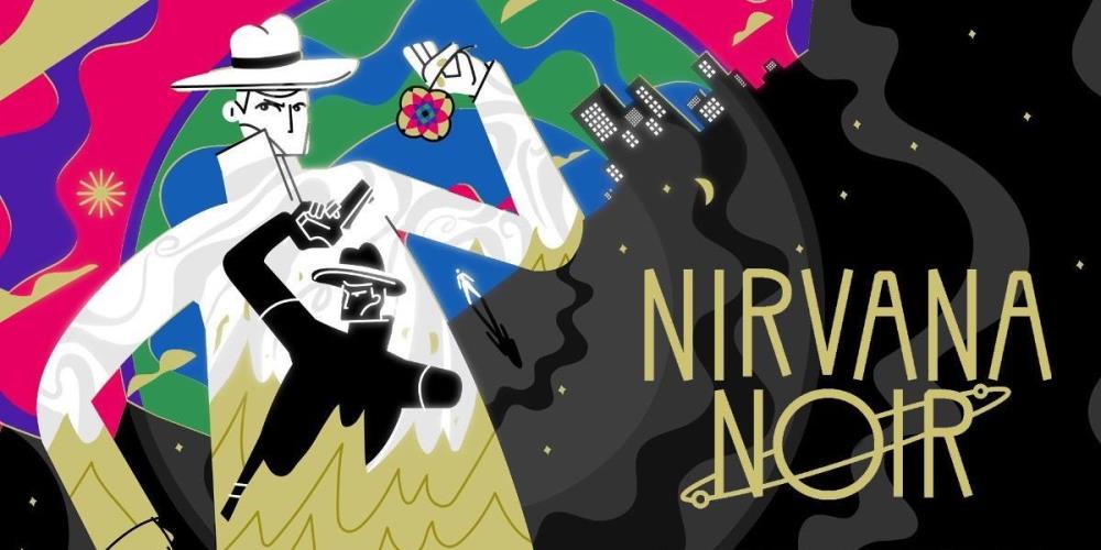
Feral Cat Den return with Nirvana Noir, a sequel to Genesis Noir centering around two different universes, and it truly feels like a bigger bang.


I really like the bottom one.
http://ps4daily.com/wp-cont...
There's probably a chance the official logo could change before release, although I still don't see a problem with the one they have.
I actually like the official logo compared to these other designs...
I like feng shui-ness of the last one. The lines flow so nicely.
Image 4 and 6 does look better, but whatever.
More interested in the stuff under the hood than the imprint.
All in my opinion of course as taste differs.
I like the fan logo, Sony should consider using it.