
There's something "off" about the new PlayStation 4 logo, and a fan-made version offers a much better alternative.
"The Barcelona-based (Spain) indie games publisher JanduSoft and indie games developer Juan-Mod, are today very glad and proud to announce that their 3D arcade action-platformer "Teared", is now available for PC (via Steam) and consoles (PS5, PS4, and the Nintendo Switch) via digital stores." - Jonas Ek, TGG.
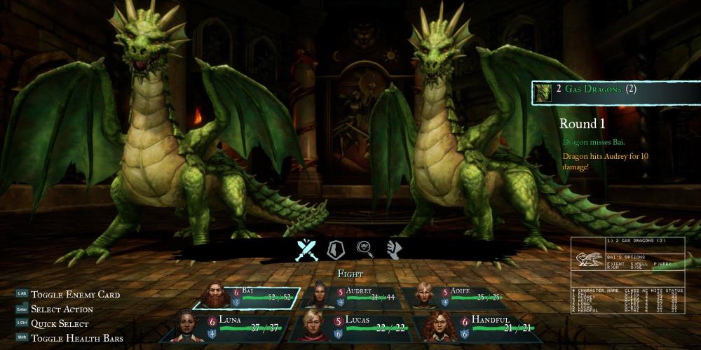
Wizardry: Proving Grounds of the Mad Overlord brings back the classic experience with revamped graphics and other improvements.
"The Spain-based indie games publisher Firenut Games and Granada-based (Spain) indie games developer Trigger the Monster, today announced with great joy and thrill that their dark fantasy adventure/management game “Search of Light” (AKA SOL), is now available for PC (via Steam) and consoles (PS5, PS4, and the Nintendo Switch)." - Jonas Ek, TGG.


I really like the bottom one.
http://ps4daily.com/wp-cont...
There's probably a chance the official logo could change before release, although I still don't see a problem with the one they have.
I actually like the official logo compared to these other designs...
I like feng shui-ness of the last one. The lines flow so nicely.
Image 4 and 6 does look better, but whatever.
More interested in the stuff under the hood than the imprint.
All in my opinion of course as taste differs.
I like the fan logo, Sony should consider using it.