
Darksiders II’s chunky, vibrant visual style came about because developers Vigil Games wanted to “own the style” and avoid the “next-gen grey” look that too many games opt for, according to lead designer Haydn Dalton and art director Han Randhawa.

Neil writes: "After holding tight and saving every spare penny since the Xmas sales, chances are you've worked up enough of a sweat to ensure that it's time to look in to the purchase of a new Xbox game or two. And with the latest Xbox Deals With Gold and Spotlight Sale for 28th Jan - 3rd Feb 2020, you'll be able to get access to all manner of cut-price Xbox One and Xbox 360 titles, boosting your digital library in the process."
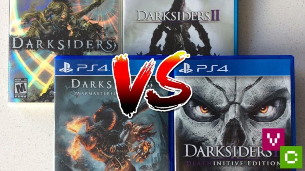
"Vigil Games may not be around anymore but their 2 Darksiders games really raised the bar for 3D action adventure games. Let's take a look at both titles' gameplay and worlds and see which one emerges victorious." - A.J. Maciejewski from Video Chums


Darksiders 1 is a complete game but it’s obvious with Darksiders 2 they ran out of budget after the Ice world and the game just becomes a poorly paced mess.
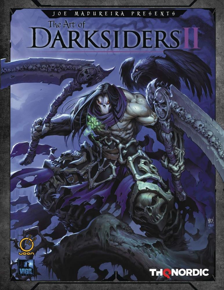
The release date has been revealed for The Art of Darksiders II Hardcover Edition.


Too true. The only colours most games go for is red for blood, grey, black, blue and dark green.
You don't see the vibrancy in colours in most games any more.
Mario galaxy is the cuddliest, cutest game ever! Sack boy is cuddly but definitely not cute, although you gotta admit the Cole train is awesome !
Meanwhile, the graphics are still PS1 level. Coming soon in 2013.
PS1 graphics, really? C'mon don't you remember how pixilated Tomb Raider was? We will have to agree to disagree then.
This game looks WAY better than the first Darksiders. Good for them. One of like only 3 games I'll buy for the rest of the year. Looking forward to it.