N4G Admin & Community Manager .::. I read every PM, I just may not respond to every PM.

Christopher

NetworkManager
CRank: 73Score: 1789670
250°

Welcome to the New N4G

As you may have noticed, we are now live with the new Web site. We know this may be a big change for some people who prefer the old site, so please let me take a moment to go over some things and hopefully help you to adjust or see how much has changed but also how the developers have tried their best to give you the control to see the site the way you are accustomed to.

If you want a quick overview of the navigation of the new site, I've also provided some images below with descriptions of what each section does.

IT'S CUSTOMIZABLE
That's right, the default view of the site is not set in stone. As shown in one of the images below, you can click one button and change the site to look the same as the old site or even to make it even more text-focused from before. Currently these options are stored in a browser cookie, so clearing your cookies may result in you needing to switch your view back to what you like afterwards (as well as reset them when viewing from a new device). Future plans are to try and have this saved to your profile, though.

THIS IS JUST THE BEGINNING
The developers are continuing to work on the site in order to make it the place where you can feel like you are getting what you want out of it. From improving on new features to giving you new ways to control what you see, the developers continue to work to improve N4G so it is a tool that truly allows you to get the news you want and that is important to you. So, please don't think that this is the end, it's the opposite.

USER CONTENT IS N4G CONTENT
Moving forward, user blogs and reviews will no longer be relegated to just a side bar, but will be placed among the same stream of news that people submit from other sites. User content will gain heat like the other content and will truly give a voice to our users who want to talk about the latest video game news or just share their review of the latest video game releases.

NO MORE BUBBLES; 10 COMMENTS FOR ALL
As promised, there are no more bubbles. Everyone can currently comment up to ten (10) times per submission. If you are interested in seeing this increased, please let the developers know via the feedback form to the right! You can still report on a user's comment using the drop-down arrow in the upper right of their comment.

THERE IS A DARK MODE
It's a little hidden, but you can click the 'Help & Info' area in the footer bar and you will see an option to 'Turn DarkMode On'.

SOME OF THE WAYS YOU CAN USE THE NEW SITE

In the upper right of the site you will find the usual tools, just looking a little different. Use the magnifying glass to search N4G for any tag, including a specific site tag. The circular avatar when clicked gives you access to your profile and the account options you've always had. The chat bubble icon when clicked will allow you to visit one of N4G's sister sites--if you don't have an account, one should be auto-created for you when you click through this way as opposed to visiting it directly.

Below the N4G logo and above the header news feed you can change what news you see. The latest link shows you the latest items approved in chronological order (newest to oldest) with the option to view items of various heat levels. The trending link will give you a look at the recent news that is gaining attention quickly. The hottest link will allow you to view the hottest news ordered by now, today, week, month, year, or all time. The pending link will take you to the submissions that are waiting to be reviewed by the community and possibly approved (the number next to it showing how many submissions are in pending currently).

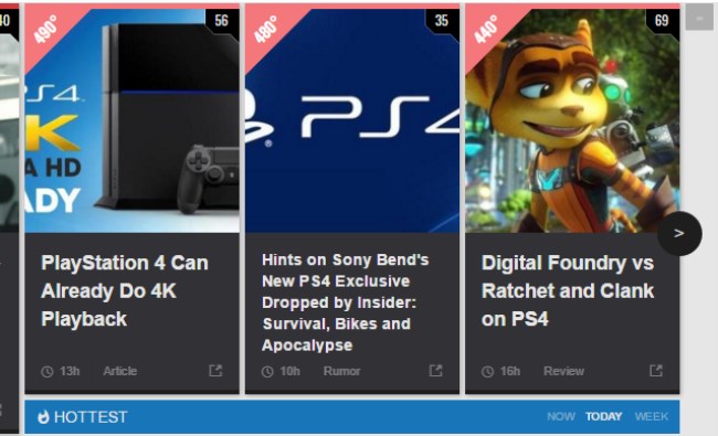
The main news header returns in the same manner you are used to on the old site. There are now four pages of hottest news, which you can navigate using the arrow icons on the sides of the header area. You can also change to view the different hottest news by now (new to about six hours old), the hottest in the last day, and in the last week. In addition, if you don't like the news header, you can choose to hide it entirely by clicking the minimize icon in the upper right of the header (and re-expand it later).

To the right of the main content on the home page of N4G are these two icons. Clicking the top icon will allow you to customize your view of the site, which defaults to the grid view. But, your options include being able to switch to a list view, mimicking the look of the old N4G site. In addition, you can choose minilist which shrinks images even further and focuses more on text or go with the supergrid option that ups your grid view with an extra column of news over the default 3 columns. The bottom icon will allow you to switch the news shown in the content body to either trending news (heat-based) or the latest news (newest to oldest). These settings are saved in a cookie in your browser, so you will need to reset your preferences when clearing them or using a different device at this time.

The most important part of the new site is the feedback button to the right of the site. This new N4G site is only the start and the owners rely on your ideas and thoughts to tell them what you want. Whether it's a problem you have on your mobile phone, a new feature you think would be great, or just letting them know what you do or don't like. This site exists solely to serve your desires to get gaming news, and telling the owners what you want is the best way to ensure that they are listening and understanding what it is you, our users, want.

equal_youth3307d ago

I need to get used to it but i kinda like it. Wasn't there a way to give the layout a black background?

Double_O_Revan3307d ago

Yea. I want my black background back.

Also, I no longer see the ability on Mobile to change my feed to 0 degrees instead of the default 50.

developer3307d ago

Hi there, you can still do it by clicking the clock icon on the sub-menu.

Christopher3307d ago

As mentioned, the Dark Mode is a little hidden in the footer. There should be some updates to improve contrast in text against the dark background soon.

Also, to your comment on 'setting your degrees option' it doesn't work like that. Viewing the 'degrees' page and viewing content over a certain degree doesn't change that preference on the home page, just acts as an alternative to the home page for content you want to see. If you want to go to that page primarily, I would suggest setting it as a bookmark of its own on your phone. Otherwise, the home page options are for switching between heat-based order or most recently published (newest to oldest) order.

Kryptix3306d ago (Edited 3306d ago )

After finding the list options, I like it better. Not the same as the old N4G, but as a work in progress, maybe we'll see new features that improve N4G instead of slightly stagnating it like how this new layout currently does.
I know it's just a thing of getting used to, but I felt that putting user content on the right in the front page was better for me because it categorized it more. Maybe one day we'll get an option to customize the front page even more, like instead of mixing user and N4G content together, we'll be able to split those two into different sections in list mode. Possibly choosing what content shows on the front page. I know there's a category option that lets you choose what to view, but I mean, I want the option to have certain combinations of content on the front page, like, single out rumors or something. Maybe there is an option like that, but I need help finding it.

I have a problem on mobile:

You know how there's different tiers of comments? Original comment, reply, and reply to reply? And when you view them on PC, it aligns the tiers of comments separately?

Well on mobile, it seems like reply and reply to reply are both in the same alignment. On my phone, both tiers are combined so it's difficult to tell which is which. I know that reply to reply has no blue "reply" option at the bottom, but that's really the only way I can tell the difference. This makes it hard for me to tell who replied to who even more.

On my phone, maybe it's the browser doing some sort of auto realignment, but I highly doubt it; I tested it on 2 browsers and the reply is properly aligned under original comment, but reply to reply isn't properly realigned under reply.

I can post a screenshot if it isn't like that for you on phone.

EDIT: Here it is. http://i.imgur.com/EGJzh9P....
You see how reply and reply to reply are in the same line? I don't like that since it doesn't much set both tiers apart.. Reply to reply should be under reply and slightly to the right. If you look on a desktop browser, it's proper. In this case, was the developer talking to equal_youth or azshorty? You won't know until you see that the developer has no reply option under azshorty which is somewhat confusing.

Also, I want a direct reply option, just like on YouTube. Where you can reply on any comment, leaving a "@username" before the comment. This way, it would be easier to check up on arguments or interactions because you will always get a notification if someone is trying to talk to you. This is a feature that would really put the new layout as a big step forward.

DARKKENT3305d ago

Hate this new cluttered confusing layout

Why mess with simplicity

+ Show (1) more replyLast reply 3305d ago
developer3307d ago

Hi there, dark mode is in the footer, in the bottom.

Double_O_Revan3307d ago (Edited 3307d ago )

Thank you & thank you. Although, that Dark mode dying is a little hard to find if you didn't tell me where to look. (At least on Mobile)

Rebel_Scum3306d ago (Edited 3306d ago )

Notifications in dark mode is unviewable. Just giving ya the heads up. And by that I mean you can't read the damn thing or tell which is new.

jb2273307d ago

Yeah, once you get the trick of changing to list view & arranging news by time instead of popularity, it's pretty close to the original. Really glad the bubbles are gone so everyone has a voice. Seems like certain users would get targeted by others & they just waited in the wings to pull a bubble from them however they could manage.

The one suggestion I'd have is to show the users who agreed or disagreed, I think that would help foster actual conversations as opposed to people just downvoting anything they didn't like but couldn't rebuke. Over all it'll take some getting used to but it's not too bad.

cyberwaffles3306d ago

Bubbles were the dumbest idea ever. Good luck ever staying on a forum full of fanboys that shut you down.

steve30x3306d ago

You still only get ten posts though. I like the Idea that the bubbles are gone though because there were too many people debubbling for no good reason.

jb2273306d ago

@cyberwaffles & steve30

Yeah I was having the same issue more recently. I'd kept the same amount of bubbles for over a year then all of the sudden it was like I was targeted by a small group of users who obviously didn't like anything I had to say even though I was always respectful of others & just voicing my opinions on games. I'm not sure how the bubble system worked in all honesty, because I'd get marked for 'off topic' when I wasn't & for 'trolling' when I was only ever responding to someone else w/ my own opinion. Meanwhile I saw some users calling others 'pathetic' & had one tell me that I was 'stupid' & 'whining like a little girl' when I was just voicing my opinion that didn't happen to jive w/ theirs. Always tried to bubble down for personal attacks when I'd see anyone doing that because if you have to resort to name calling, you don't deserve to be in a public forum w/ grown ups & actual human beings, but those people never got marked & kept all of their bubbles. Hopefully this new system can keep that stuff away. Some threads just turned mega hostile for no real reason, people attacking writers & other commenters just for sharing their opinions in a place created to do exactly that.

starchild3307d ago (Edited 3307d ago )

Yeah, it's going to take some getting used to, but I like a lot of the changes they've made. It's also cleaner and easier to use on mobile browsers.

Oh, and doing away with the bubble system is a very smart move. People can still show agreement or disagreement using the respective buttons, but now people don't get censored for merely having an unpopular opinion.

cyberwaffles3306d ago

And what's sad is that the unpopular opinion is sometimes true but gets drowned out by the naysayers. This site is just a popularity contest. Like a witch being burned at the stake for believing differently than the rest of the community.

Fin_The_Human3306d ago

I don't like it :(

Please give me the option to go back to the old site.

equal_youth3306d ago

Have you tried the List option? It's at least better than the tablet design.

Fin_The_Human3306d ago

Will try it.

Also why dont I get the red flashy thing anymore for notifications ?

lelo2play3306d ago (Edited 3306d ago )

This new version looks like crap. If it ain't broke, don't fix it.

There should be a option to use the old site.

3305d ago Replies(1)
BEASELY3302d ago

I'm just happy N4G is finally Mobile friendly.

+ Show (5) more repliesLast reply 3302d ago
Imalwaysright3307d ago (Edited 3307d ago )

I'm glad to know that this still a work in progress because right now this "new" N4g is worst in every possible way. at least give us the option to directly reply to people that reply to us.

Christopher3307d ago (Edited 3307d ago )

That is unlikely to change. It uses the same system of three-tier comments as it did before. So, the first two tiers get direct responses, the third tier does not.

The best way for it to ever see a change is to feedback it to the developers.

Just FYI, this is unchanged from the "old" N4G...

@below: Feedback any features you would like. That's how things happen, you guys tell them what you want and they take it from there. So, yes it's possible, but it relies on users informing them of their desires.

Imalwaysright3307d ago

"Just FYI, this is unchanged from the "old" N4G"

But this is the "new" N4g :(

Anyway I found that mini list option and its better to me now. Is there any way to costumize the comments section as well or will it be possible in the future?

Servbot413307d ago

"Just FYI, this is unchanged from the "old" N4G... "
The one thing that needed to be changed. THE ONE THING.

cyberwaffles3306d ago

Just make it like youtube where you can reply to everyone. Right now its too cumbersome and confusing.

ninsigma3306d ago

It wouldn't need to change from 3 tier. If your comment is on the third tier and someone clicks reply, their comment could also be out on the third tier but at least we'd get a notification for and the 2nd tier comment won't have to get a notification for a comment directed at someone else. That's a pretty glaring issue in my eyes at this point. Other than that the new site is cool but I can't click the comments button under personal profile on my phone. I've given feedback on that.

oasdada3306d ago (Edited 3306d ago )

This is just worst in every way.. had to wait minutes just to be able to reply to u.. and please bring back pages, its fairly easy to loose track of where I was cause of the new "load comment" button on the bottom. Which was once a website I logged in every other minute is now a hassel for me just to see this ugly UI to catch news. Its becoming v difficult for me to come back to this website. Please isnt there a way to have both? A "classic" version button or something ?

3305d ago
+ Show (3) more repliesLast reply 3305d ago
-Foxtrot3307d ago

That's right. Put it in the feedback section and a developer will get onto it right away...in about 7 years :)

Christopher3306d ago

Or do nothing and it never changes. *shrugs*

steve30x3306d ago

During the beta a few of us requested a dark mode and a few days later they gave us a dark theme.

developer3306d ago

At a later stage there will be an update to the comment section where there will always be a reply button and on the inner tier it will just append @username in the post. People are doing this manually now already.

DragonDDark3306d ago

@developer

I want it but nothing is happening :((((

ninsigma3306d ago

That's exactly what I said above. Should have read further down :p
I'm assuming then that we will get a notification regardless of being a 3rd tier comment??

Bdub20003306d ago

People rarely like change... The changes aren't bad at all, they just take time to get used to them. Gotta keep innovating, can't stay he same forever.
And hopefully this new comment system restores a little civility amongst the community.

+ Show (1) more replyLast reply 3305d ago
LP-Eleven3307d ago

Glad it's customizable! Will take a little getting used to, but that makes it infinitely more useful, in my view!

Iceball20003307d ago

I don't mind it. It's nice and it's mobile friendly too. I use to use m.n4g.com. It'll take a bit to get use to. Is there away to go to lights off mode? I prefer a dark background.

Goldeneye0073307d ago (Edited 3307d ago )

This new layout is awful. It just looks like a bunch of shit was thrown on the floor. I'd really like to have the option of a list layout. We should be able to switch between list and grid.

Christopher3307d ago

You should read the blog, then. We explain how you can change it to the old layout.

xfiles20993307d ago

Tell us how to change it back I really hate this new layout

Kurisu3307d ago

I'm liking this new site. I didn't find the old layout very user friendly for mobile, so I always used the mobile view site. That was pretty basic though and you didn't get any notifications. Now that this has been revamped I will always use this new one :)

Jag-T10003306d ago

Don't tell me to go to a blog to learn how to change it, just tell me right now in this thread.

+ Show (1) more replyLast reply 3306d ago
FunAndGun3307d ago

You can change your view....did you read this post? 2 buttons on the side of main page.

Goldeneye0073307d ago

Yeah, I read it thoroughly this time. All is well now.

Show all comments (283)
120°

CTA Warns Trump Tariffs Could See Console Prices Rising By As Much As 69% In US

PSU writes: "Back in January, the CTA published a report by the Trade Partnership Worldwide LLC (TPW) that looked at the potential impact of Trump’s tariffs based on his campaign progress. As the tariffs have now been imposed, the CTA has issued an updated version of the report that accesses their actual impact, and focuses on video game consoles, laptops, smartphones, and more."

PRIMORDUS1h ago

PC and torrenting go hand in hand lol I will not be the one buying a Switch 2 then, probably will pass on the preorder notice from Nintendo if I receive it, because I am not paying $70, $80 or even $90 for a game if prices increase. This Orange shit bag thinks he can tariff digital goods, what a dumb ass, we can get games, movies, tv shows, etc for free try again lol.

anast25m ago

This would be a good reason to go PC. We'll see.

Eonjay15m ago

I don't understand because are PC part prices gonna just rise too? The best outcome for gamers is to see the tariffs rescinded and quickly before the increase take hold.

btmgov291h ago

All you PC dirtbags that steal digital goods.......your day will soon be coming too. I have no problem with the hammer coming down on these foreign based companies. They need to start moving their production facilities and jobs to this country and producing their goods in this country, which will happen when no one buys their products anymore.

SavageFlamingo33m ago

You have a child’s grasp of economics.

anast27m ago

You are talking to a child.

PRIMORDUS26m ago

Don't forget movies, tv shows, music etc. We can all torrent. How can the orange idiot do anything about that lol. Take down one torrent site, there are others in it's place, hundreds. It's like a weed remove one more pop up. Also there is the old school way of pirating, Usenet which has been around since the early 80s.

Show all comments (12)
80°

10 Legendary Games That Still Absolutely Crush It in 2025

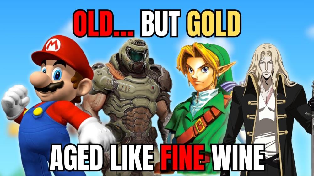
Discover 10 timeless video games from the past that remain absolutely playable today. From Chrono Trigger to DOOM, these classics have aged like fine wine!

Read Full Story >>
gamegeeked.com
anast19m ago

Simon's Quest is better than Symphony.

70°

Razer Announces Clio: Their New Wireless and Cordless Gaming Chair Speaker

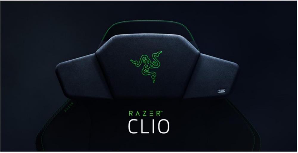
Razer, the leading global lifestyle brand for gamers, today unveiled the Razer Clio, in innovative gaming chair accessory designed to deliver headset-like immersive audio without the constraints of wearing one.

Read Full Story >>
terminalgamer.com