One Tiny QoL Change Might Make a Huge Impact on The First Descendant
- Aug 12 2024
- Aug 12 2024
Let’s be honest, Quality-of-life changes are always welcomed, regardless of the game. These subtle fixes can really improve your overall enjoyment, hence the name. The First Descendant is not the best when it comes to clarity (some features are practically hidden and you have to discover them yourself), so a little improvement in that regard would be nice.
Nexon Could Look Into External Components
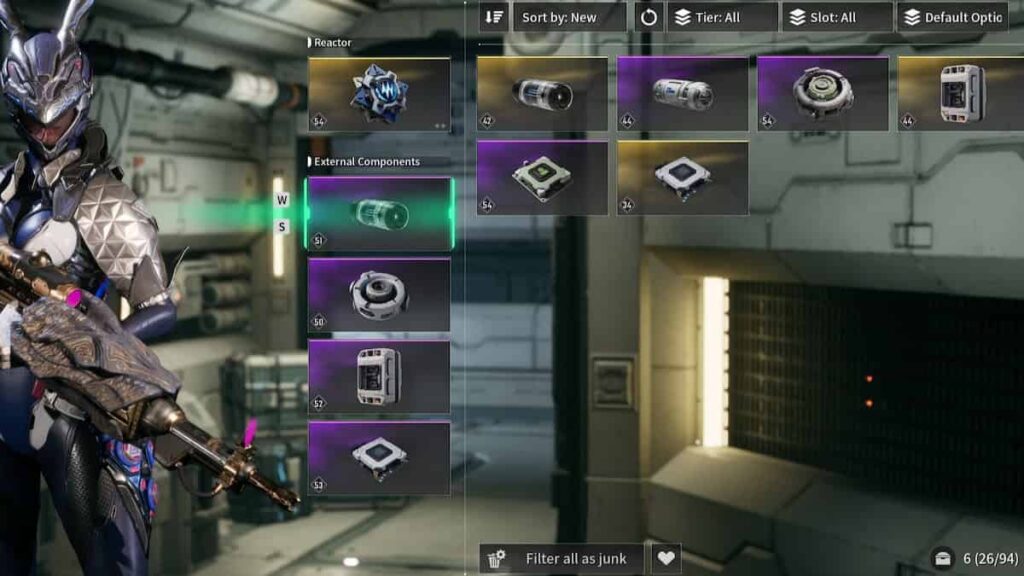
One of the things that irritate almost every TFD player is how the External Components are listed. When you select one of them to change, be it Auxiliary Power, Memory, Processor, or Sensor, you’d expect to only be offered a list of the same category. But no, you will be offered a list of ALL External Compones that you have regardless of the category that you’re looking for. Naturally, that irks some players (the author included). Can I only see my Sensors? Nope, here’s everything you ever picked up.
One player, named bmexxxzee on Reddit, started a thread discussing this and demanding that the game only show you the External Components type you selected. Surprisingly the opinions are mixed. Some players add that this was a feature during the beta, and for some reason, it was removed in the 1.0 version. User SuperbPiece sad: “I spent minutes trying to get it back with the filters on top, and thought I was just dumb after giving up. I can’t fathom a single reason why they would remove it. It was so much more readable..”
Not Everyone Agrees
Surprisingly, not everyone is on board with this idea. The problem is that, if you divide all the Components into four categories, it will take you four times more time to select everything you want as Junk and dismantle it. For example, No-Zucchini2787 stated: “Please no. I already think 3 places for same inventory items is too much. I wanna see [in] one place all inventory items. Mostly I am selecting all and deleting during farming. Already I need to select weapons then reactors then components. I don’t wanna select 6 places..“
A compromise would be best here. Maybe the category you selected could be highlighted and the rest darkened. Or just the selected category brought to the top of the list. That way you’ll clearly see the Components you need, and the rest will be there for easy dismantling.

Reactors Could Also Use One Improvement
While we’re discussing QoL improvements for the right-hand side of the inventory screen, Reactors could also use one significant improvement. As explained by AnthraxVirus_Bx: “What I want is an icon on it (reactors too) to show on which character it is equipped…Because when you want to « clean » your stash and have separate reactors or components of the same kind with different stats for different characters it is hard to tell which one…Example: you have 2 electric reactors (one for Bunny one for Sharen) could be nice to see which one is equipped on whom“ and we couldn’t agree more.
It’s pretty easy to accidentally dismantle a Reactor that you’re using with another Descendant. The more characters you have, the easier it gets to make a mistake). Adding just a small icon (a Descendant’s face in a circle, for example) to the Reactor/External Component equipped by another character would work wonders.
All of these changes are pretty small, but would greatly improve the clarity of the game, so we hope Nexon does something about this in future updates.