
PSUni: "PlayStation Network is a great place to get a lot of games, videos, and other content that can enhance the gaming experience. Purchases and downloads are quick and the store is organized neatly into games, videos, and other sections, but there’s one thing that would make the store much better: a more simplified search feature."

Video games are no longer just a simple past time. Today's games are evolving into true works of art. Offering intriguing narratives, cinematic setpieces, and profound messages, games can entertain us for hundreds of hours.

I never got around to mass effect - I’m skeptical that it would hold up if I were to try it now
Originally launched in 2011, El Shaddai: Ascension of the Metatron is coming to Nintendo Switch, so It's time to look back at the original.

Still have my ps3 copies. Bought it at launch and another one when I found it cheap and in perfect condition about 10 years ago. I wouldn’t buy it on Switch but if they made a PS5 version I would. I still have one of my PS3 Fats hooked up so good to go either way.

Id play it again on the switch. I wished my 360 version was bc but this is still a good way to play.
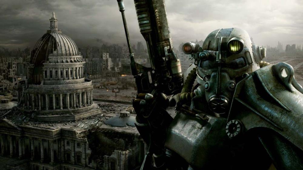
The artist behind Fallout 4’s Deathclaw reveals just how bad things got back when Bethesda took over the series

People are stupid I get it. No one should feel unsafe,
But I think they need to talk about why they cut so many corners during the development process and why none of their games ever look current. And why they think all of this is okay while they charge full price.


I want the old store back. I feel it's easier to navigate and loads faster.
I do like the presentation of the new store, it does look modern.
Change it back maybe? Seriously what was wrong with the old one?
Also, I just got NBA Jam because of plus, and I'm pretty sure I clicked like 12 times to download it. Click click add to cart click click confirm accept click click download.
The new store is an epic fail.
Looks nice but barely works, is full of bugs and the search engine sucks.
Also the Vita store should be brought up to the top and not stuck at the bottom of the selection screen where no one can see it.
It's like looking into a bucket full of bats, i'm almost afraid to move around the store.
They should go back to the old design.
Maybe organise the download list into different categories such as full games, demos, add ons, themes instead of having to scroll through an enormous list of everything I downloaded over the years. Also a little icon beside all items in your download list letting you know what's downloaded and installed on your system, this would be especially handy for add ons.