
A few weeks ago, and despite the proximity of Firefox 3.5 final release, Mozilla announced its intention to revisit the logo for a subtle update that reflects the deep changes it has experimented in the last three major releases since its last retouch around Firefox 1.5 release.
In a post by Firefox User Experience team member, Alex Faaborg, he introduced the first of a daily series of logo proposals. Today's (shown next to the current and original versions) presents a rendering by Anthony Piraino, based on a conceptual sketch by Jon Hicks (the original logo creator) from November 2007, that "introduced additional detail to the fur, and the flames starting to wrap around planet mozilla which significantly modernizes and streamlines the appearance of the icon."
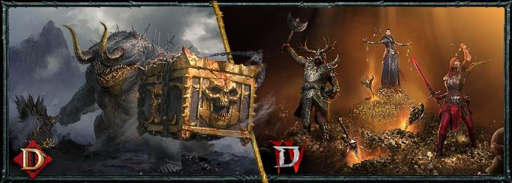
Come celebrate the 1-year anniversary of Diablo IV and the 2-year anniversary of Diablo Immortal! There are heaps of rewards to mark these celebrations with a bounty of devilish goods across both games.

Tales of the Shire has many hurdles to jump to live up to the J.R.R. Tolkien masterpiece, and magical elements might be its most pertinent one.
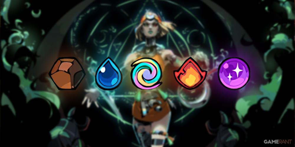
There are four different elements in Hades 2, each of which can be ranked according to their overall power and effectiveness in battle.


it's purdy
I like it.
The "Proposed Version" is really dark, and I don't like it much. It looks kind of tacky in a way.
The color and appearance of the one at the end of the article, though (under the update), is much more enticing to me. Looks sleeker and cooler than the proposed one.
I'm digging that one the most :D
I really like the Proposed Version, looks awesome!
New World Order?